
学士
かたちがな:外形の影響に基づくひらがなのタイプフェイスデザイン
ヴィジュアルコミュニケーションデザインスタジオ
#グラフィックデザイン#タイポグラフィデザイン#ブックデザイン
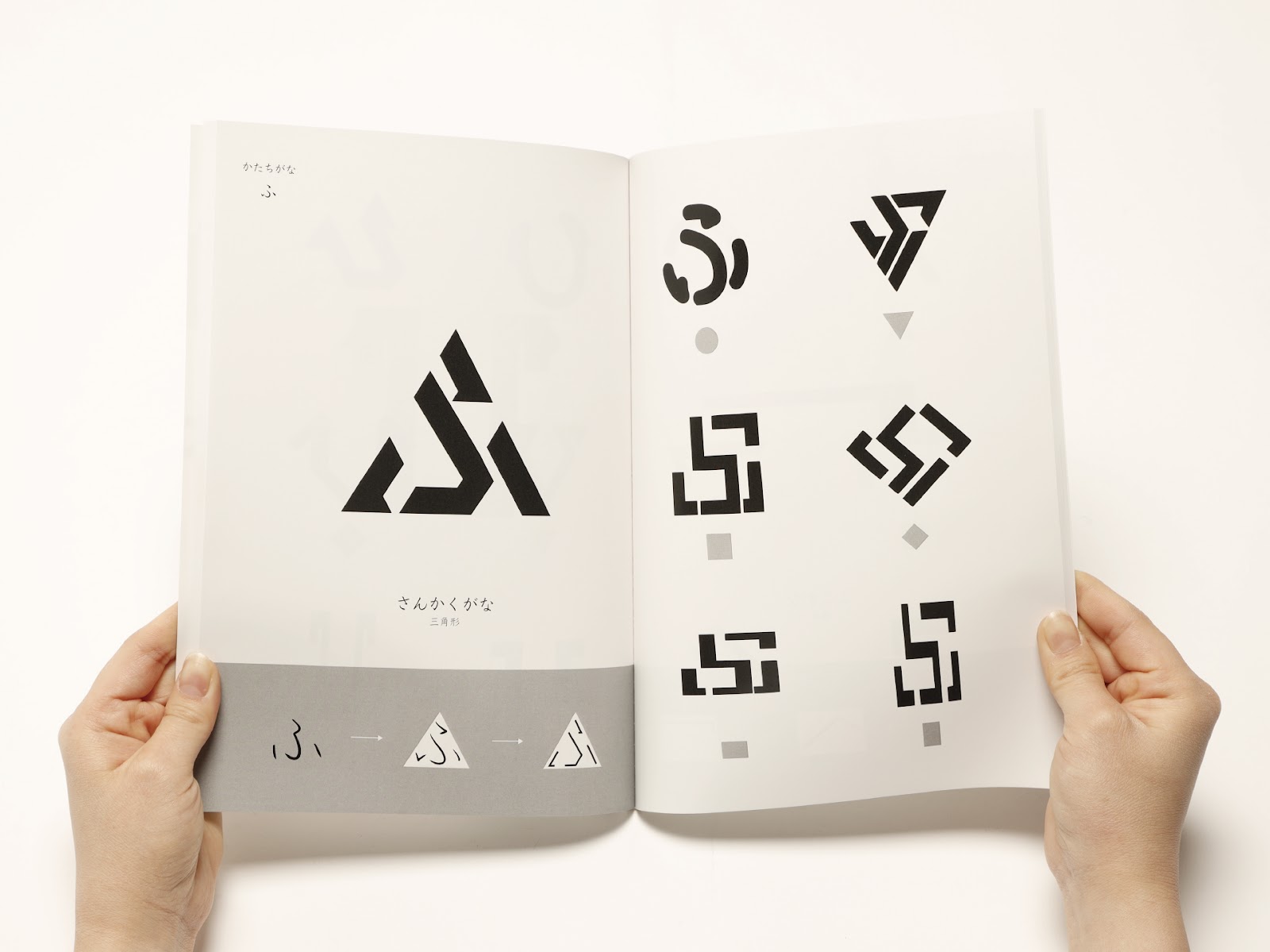
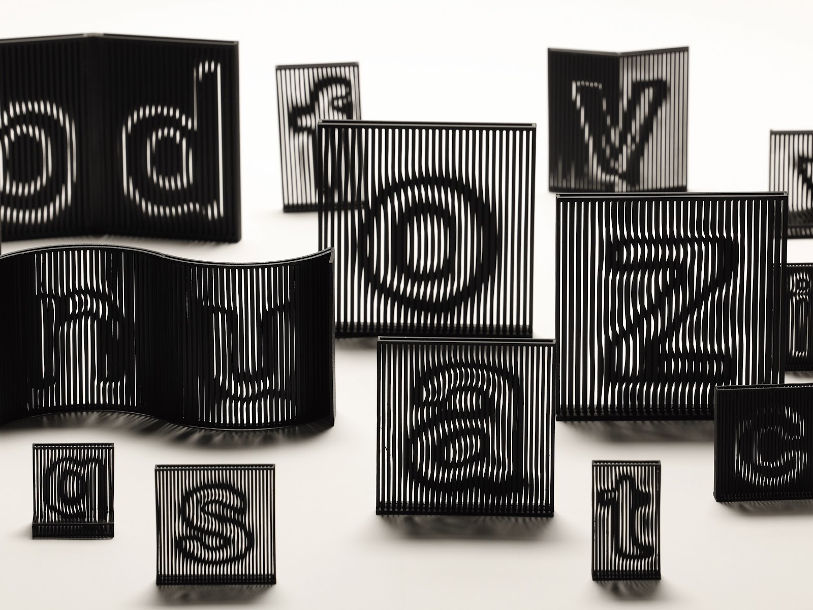
文字には、文字全体を囲む輪郭として「外形」が存在する。外形を意識して文字を書くことで、字形の安定や均整をもたらし、美しさや視認性が向上するとされている。ひらがなは、漢字を起源としながらも、曲線を主体とした柔軟な造形を特徴とする文字体系である。そのため、文字ごとに異なる形態的特徴が存在し、ひらがなの外形は円形、三角形、逆三角形、正方形、ひし形、横長、縦長の全7種類に分類することができる。
本研究では、本来美しく文字を書くための指標である外形に着目し、その形態的特徴を極端に強調した「かたちがな」という新たなひらがなのタイプフェイスを制作した。文字の美しさ向上などが目的の外形を、造形的制約として文字設計の主軸にすることで、文字と形態の関係性を再定義することを目的としている。「かたちがな」は、7種類のそれぞれの外形を基にした「えんがな」「さんかくがな」「ぎゃくがな」「せいほうがな」「ひしがな」「よこがな」「たてがな」で構成されている。濁音および半濁音を含むひらがな全71文字を対象とし、各文字を7種類の外形に基づいて合計497文字のタイプフェイスをデザインした。「かたちがな」を視覚的に紹介する書籍を制作するとともに、体験的理解を促すためのWebサイトも制作した。このWebサイトでは、実際に任意の文字を入力することで外形の違いによる書体の変化を体感することが可能である。また.ttf形式のフォントファイルをダウンロードできる仕様にすることで、鑑賞にとどまらず実際のデザインや制作の現場において活用可能な環境を整えた。
本制作を通して、ひらがなの外形と造形的制約の関係を可視化するとともに、文字を「読むもの」だけでなく「形として認識するもの」として捉え直す可能性を示した。また、外形を極端に強調した設計により、個々の文字の意味が理解される以前に、形態としての印象が先行して知覚される場合があることが確認された。文字は情報伝達のための記号であると同時に、独立した視覚的存在としての側面を有している。本制作は、そうした二面性に着目することで、文字を視覚表現として扱う際の新たな可能性を示唆するものである。
Characters possess an “External Shape,” defined as the overall contour that encloses the entirety of a letterform. Conscious attention to this External Shape in writing contributes to structural stability and visual balance, thereby enhancing aesthetic quality and legibility. Although Hiragana originates from Kanji, it developed into a writing system distinguished by supple, curve-oriented forms. Owing to these characteristics, each character exhibits unique morphological features, and the External Shapes of Hiragana may be classified into seven categories: circular, triangular, inverted triangular, square, diamond, horizontally elongated, and vertically elongated.
This study examines the External Shape, conventionally regarded as a guideline for achieving visual refinement in handwriting, and reinterprets it as the principal formal constraint in typeface design. Based on this premise, a new Hiragana typeface entitled “KATACHIGANA” was developed, in which the morphological characteristics of each External Shape are deliberately and rigorously emphasized. By repositioning the External Shape from a supplementary aesthetic consideration to the central structural framework of design, this project seeks to redefine the relationship between character and form. KATACHIGANA comprises seven typeface variations corresponding to the respective External Shape categories: ENGANA, SANKAKUGANA, GYAKUGANA, SEIHOUGANA, HISHIGANA, YOKOGANA, and TATEGANA. The project encompasses all seventy-one Hiragana characters, including voiced and semi-voiced forms, each rendered according to the seven External Shape classifications, resulting in a total of 497 glyphs. In addition to a publication introducing KATACHIGANA visually, an interactive website was produced to facilitate experiential understanding. Users may input arbitrary text to observe transformations derived from differing External Shapes, and downloadable .ttf font files enable practical application in design contexts.
Through this endeavor, the relationship between the External Shape of Hiragana and formal constraint has been elucidated, demonstrating the potential to reconsider characters not solely as linguistic signs but also as autonomous visual forms.
Map
この作品は Gallery A : A37にてご覧いただけます。
この作品に関連した作品・研究
お気に入りの作品
© 2026 Department of Industrial Art, Tokyo Metropolitan University